


Executive Summary
The American workforce peaked in November 2025. It hit 171.5 million people and started shrinking. That has never happened outside a recession in the modern record.
The workforce is getting smaller, and almost nobody is talking about it.
A few questions organize what follows. How is workforce participation actually calculated? Who is in the count, and who got left out? How do population and GDP connect, and what happens to the economy when the population stops growing? What does any of this mean for people who plan workforces for a living? And is the next decade a war for talent, or something stranger?
The short version goes like this. The participation rate is a fraction, and most people get the bottom half wrong. The count includes every worker in the country, papers or no papers, and excludes a third of America. GDP is workers times output per worker, full stop. A flat population means productivity has to carry the whole load. And the planning implications are bigger than the headlines suggest.
The data comes from the Bureau of Labor Statistics, the Bureau of Economic Analysis, and the Congressional Budget Office. The forecasts are mine, built on their assumptions, which are printed on every chart. When a number is an estimate instead of a measurement, I say so.
1. How Workforce Participation Is Calculated
The participation rate is the most quoted number in labor economics. It is also the least understood. The math is one fraction.
The top of the fraction is the civilian labor force. That means everyone sixteen or older who is working or actively looking for work. One hour of paid work in the survey week counts as working, which tells you something about how generous the definition is.
The bottom of the fraction is the civilian noninstitutional population, age sixteen and up. It is not the total population. Getting this wrong is the most common error in workforce commentary, and it is not a small one.
In May 2026 the math ran like this. The labor force was 170.1 million. The eligible adult population was 275.1 million. Divide, and you get 61.8 percent.
Nobody counted anybody. Both halves of the fraction come from a survey of 60,000 households.
The survey is the Current Population Survey, run monthly by the Census Bureau. Every number here is an estimate with a margin of error. The definitions have held steady since 1994, which is the only reason fifty-year comparisons are honest.
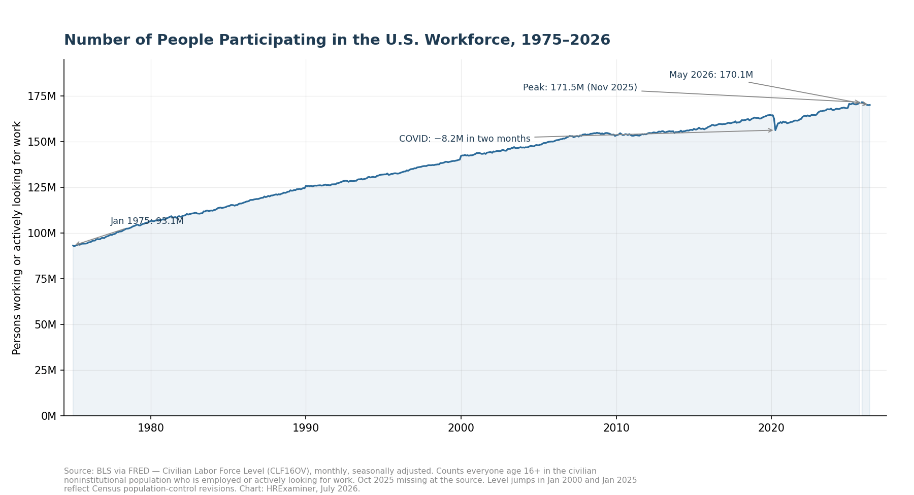
Figure 1. The numerator: the civilian labor force, monthly, 1975–2026. The count peaked in November 2025.
The history reads differently once you know the math. Participation rose from 61 percent in 1975 to 67.3 percent in early 2000. Women entered the workforce and the boomers hit their prime years at the same time.
Then it fell, and the falling was mostly demographics. A retiring boomer stays in the bottom of the fraction and leaves the top. COVID knocked the rate to 60.1 percent in April 2020, and the recovery stalled at 62.5.
The past year shows a slide to 61.5 percent. That is the lowest sustained reading since the late 1970s. It is worth your attention.
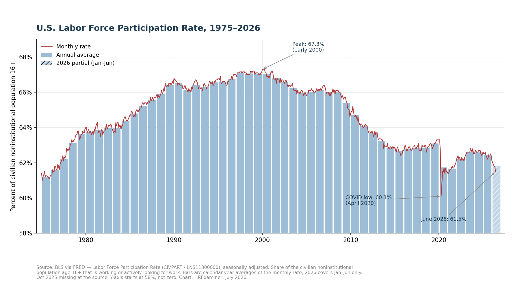
Figure 2. The participation rate, monthly line over annual-average bars, 1975–2026.
One measurement problem matters right now. The population estimate on the bottom of the fraction runs on autopilot between annual Census corrections. When deportations and a closed border remove people, the denominator does not notice until January.
People leave the country. The population estimate keeps growing anyway. So the measured rate falls further than actual behavior explains.
Expect a downward correction in the January 2027 numbers, and do not let anyone sell it to you as news about worker motivation.
2. Who Is — and Isn’t — in the Count
America holds about 342 million people. The participation math only sees 275 million of them. The other 67 million are invisible to the statistic.
Children under sixteen sit outside the count entirely. So do about 3 million people in prisons, jails, and nursing homes. So do 1.3 million active-duty troops, which surprises people every time.
Measure against the whole country instead of the eligible adults and the picture changes. Less than half of all Americans are in the labor force. About 47.6 percent actually hold a job.
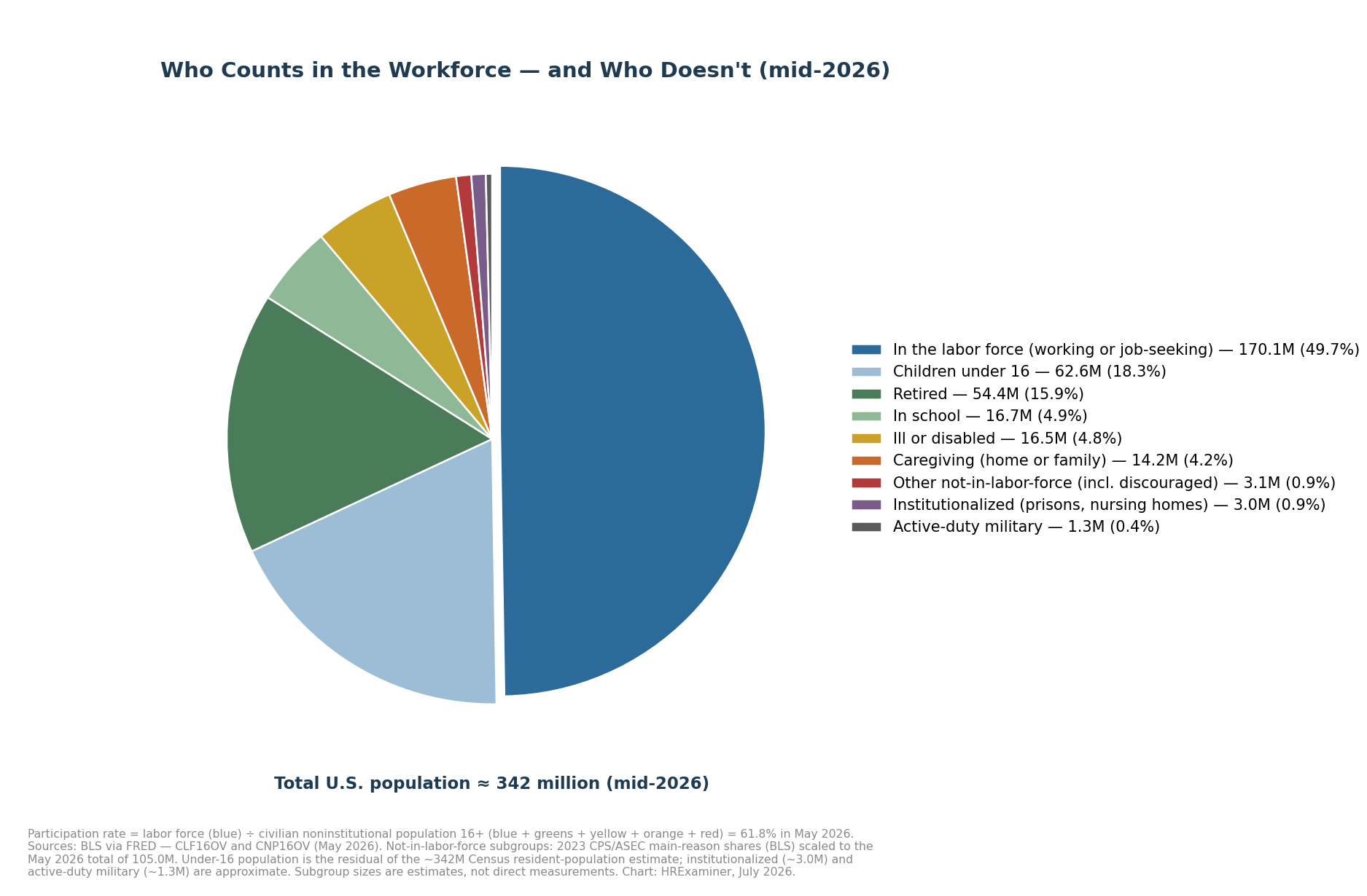
Figure 3. Where all 342 million Americans sit, mid-2026. The participation rate divides the blue slice by everything except children, troops, and the institutionalized.
Now look at the 105 million adults who are eligible but not participating. The commentary treats them like a mystery or a moral failure. They are neither.
About 54 million are retired. About 17 million are in school. About 16 million are too sick or disabled to work, 14 million are caring for family, and 3 million are everything else, including the few hundred thousand who wanted a job and gave up looking.
The people outside the labor force are not slackers. They are your parents, your kids, and your neighbor with cancer.
On immigration, the count is broader than most readers think. The survey never asks about legal status. Citizens, green-card holders, visa workers, and undocumented workers all get counted the same way.
Foreign-born workers were 19.2 percent of the labor force in 2024. What the survey cannot tell you is whether a missing person left the country or just stopped answering the door. Right now, some of each is happening, and nobody can split the difference precisely.
One more distinction completes the picture. Of the 170.1 million in the labor force, 162.8 million were working in May 2026 and 7.3 million were looking. Employment peaked in December 2025 and has given back 1.7 million jobs since.
3. The Churn Beneath the Surface
Here is the habit that ruins most workforce reporting. Everyone stares at the monthly net change. Almost nobody looks at the gross flows underneath it.
About six million people leave the labor force every month. Roughly as many come in. The famous net number is the tiny difference between two huge flows.
The workforce is not a reservoir. It is a river.
Over a year, the exits add up to about 73 million person-transitions. The net change in a good year is one to three million. That ratio should change how you read every jobs headline you see.
Two cautions about the exit numbers. They count transitions, not people, so a person who leaves twice counts twice. And the data simply does not exist before 1990, because the government did not collect it.
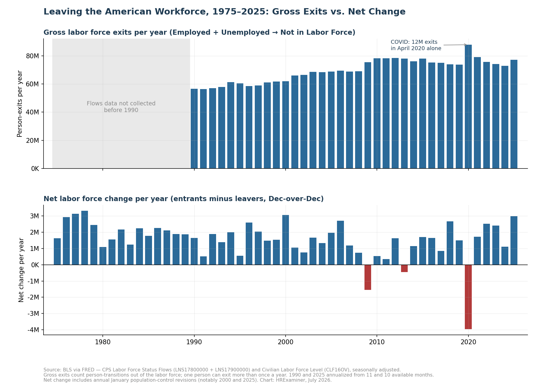
Figure 4. Annual gross exits (top) versus annual net change (bottom), 1975–2025. Check the scales: tens of millions versus single-digit millions.
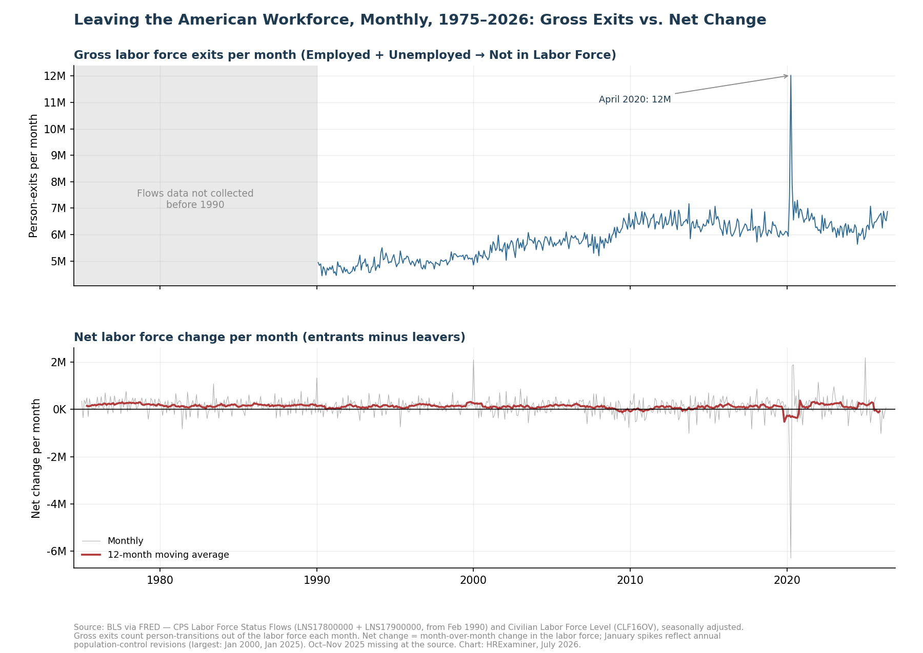
Figure 5. The same story, monthly. April 2020 produced twelve million exits in one month.
Three companion charts finish the picture. The labor force nearly doubled from 93 million in 1975 to just over 171 million at the peak. Exits have been running at record levels through 2025 and 2026.
And the net-change chart shows 2026 on track to be the worst non-recession year in the whole fifty-one-year record. Sit with that for a minute.
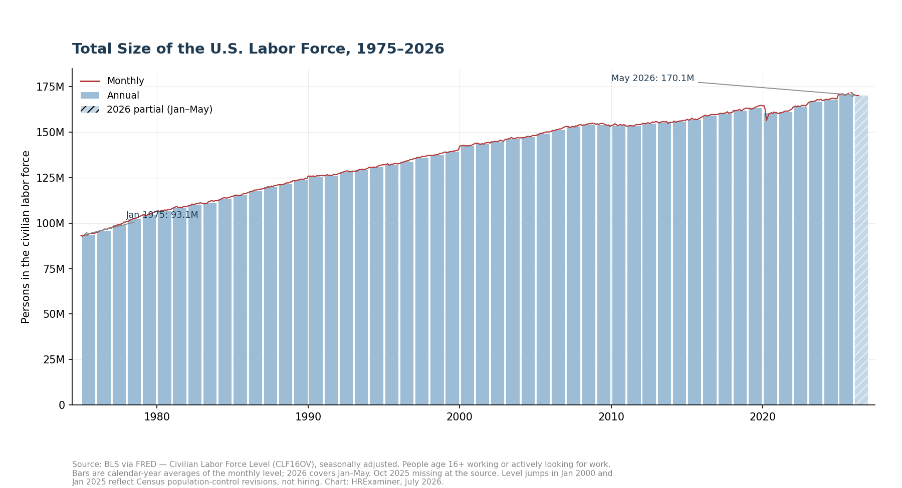
Figure 6. Total labor force size, annual bars with monthly line, 1975–2026.
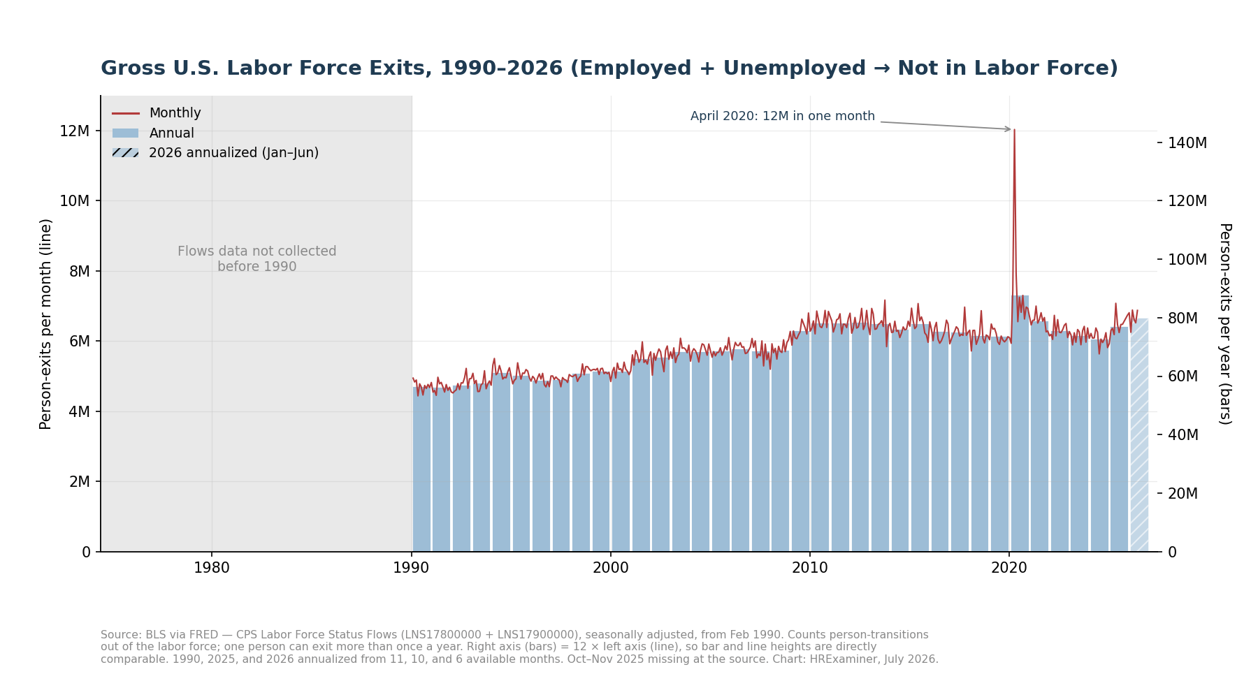
Figure 7. Gross exits, 1990–2026. The right axis is exactly twelve times the left, so the bars and the line compare directly.
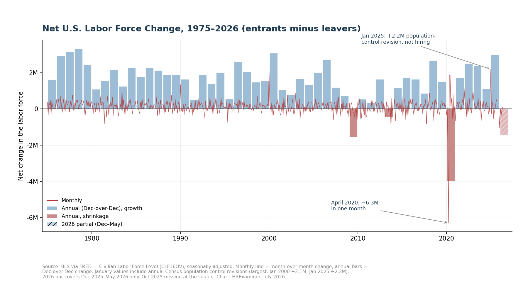
Figure 8. Net labor force change, 1975–2026. The January spikes are Census paperwork, not hiring.
4. Who Is in the Workforce: Gender and Age
The gender story is a revolution followed by a stall. Women were 40 percent of a 94-million-person workforce in 1975. They are 47.7 percent of 170 million today.
Look closer and the revolution ended around 2000. The line has been flat for twenty-five years, five or six points short of parity. Any honest forecast holds the mix steady, because that is what the data says.
There is one wrinkle worth watching. Women’s share ticked up in early 2026. The immigration-driven decline is hitting men harder, because immigrant workers skew male.
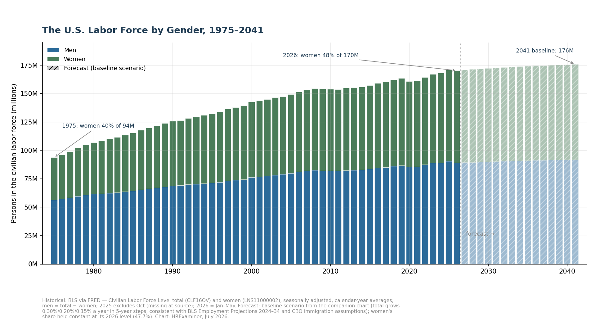
Figure 9. The labor force by gender, 1975–2041. Hatched bars are the forecast.
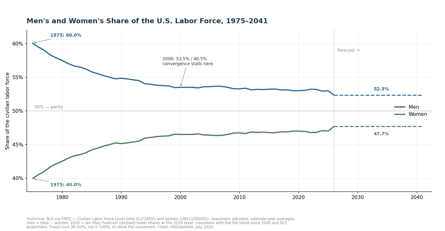
Figure 10. The same shares as lines, zoomed to where the movement actually is.
The age story is a boomerang. The median worker was 34.6 years old in 1980, the youngest modern workforce America ever had. Then the same generation that made it young spent thirty years making it old.
The median hit 42.0 by 2014 and then, surprisingly, went flat. Boomer retirements started pulling old workers out as fast as everyone else aged. BLS says the climb resumes, reaching 42.4 by 2034 and roughly 43 by 2041.
One data caution here. BLS publishes the median age about once a decade, not annually, and it publishes the median rather than the average. The line between the dots is my interpolation, clearly marked.
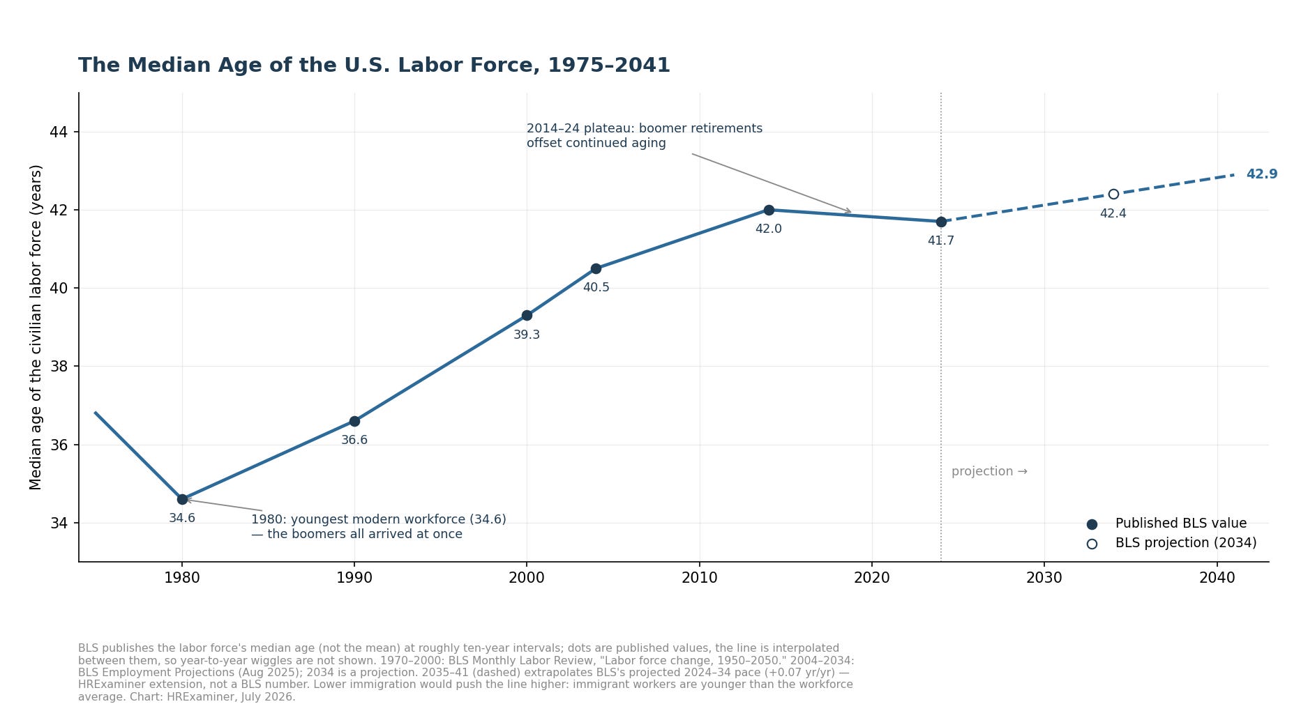
Figure 11. Median age of the labor force, published BLS values with interpolation, 1975–2041.
5. The Outlook to 2041: Three Scenarios, One Lever
Workforce forecasting is arithmetic wearing a crystal ball costume. Everyone who will be forty in 2041 is twenty-five right now. The native-born workforce of 2041 is already born and already counted.
Only one input is genuinely adjustable, and it is immigration.
The official assumptions just moved violently. CBO says net immigration collapsed to 410,000 in 2025, down from over three million at the peak two years earlier. Meanwhile deaths start exceeding births around 2030.
After that, every net addition to the American population is an immigrant or an immigrant’s child. That is not an opinion. That is what the birth and death tables say.
The scenarios in Figure 12 spell it out. The baseline follows the government assumptions and reaches about 176 million workers in 2041. High immigration gets you 183 million, and near-zero immigration shrinks the workforce to 166 million.
Watch the heavy line, the growth rate. It ran 3.3 percent a year in 1978, about 1 percent in the 1990s, under half a percent since 2008, and negative in early 2026. The whole game for the next fifteen years is whether that line lives above or below zero.
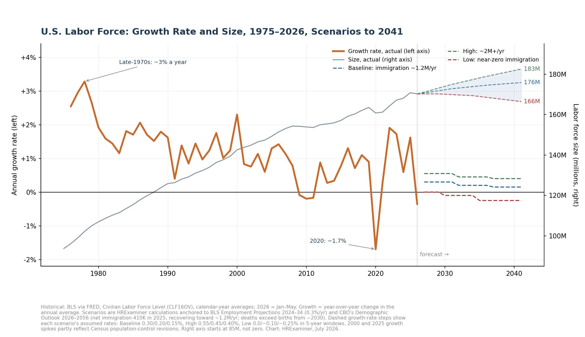
Figure 12. Growth rate (heavy line, left) and size (right), with three scenarios to 2041.
What would prove me wrong? A surge of older workers staying on the job, a fertility recovery no rich country has managed, or a change in how the counting works. Absent those, the fan holds.
The shakiest assumption is political, not demographic. The baseline bets that labor scarcity eventually forces the immigration tap back open. That is a judgment about Congress, and you know what that is worth.
6. How GDP and Population Are Related
The chain from population to GDP has three links. Babies become workers sixteen years after they are born. Immigrants become workers the day they arrive.
Working-age people become the labor force through the participation rate. The labor force becomes GDP through productivity. Total output is workers times output per worker, and there is no third ingredient.
GDP growth equals workforce growth plus productivity growth. Write it on the whiteboard.
The last fifty years show the formula at work. The economy is 3.9 times its 1975 size on a workforce only 1.8 times as large. The gap between those numbers is a half century of machines, software, and better organization.
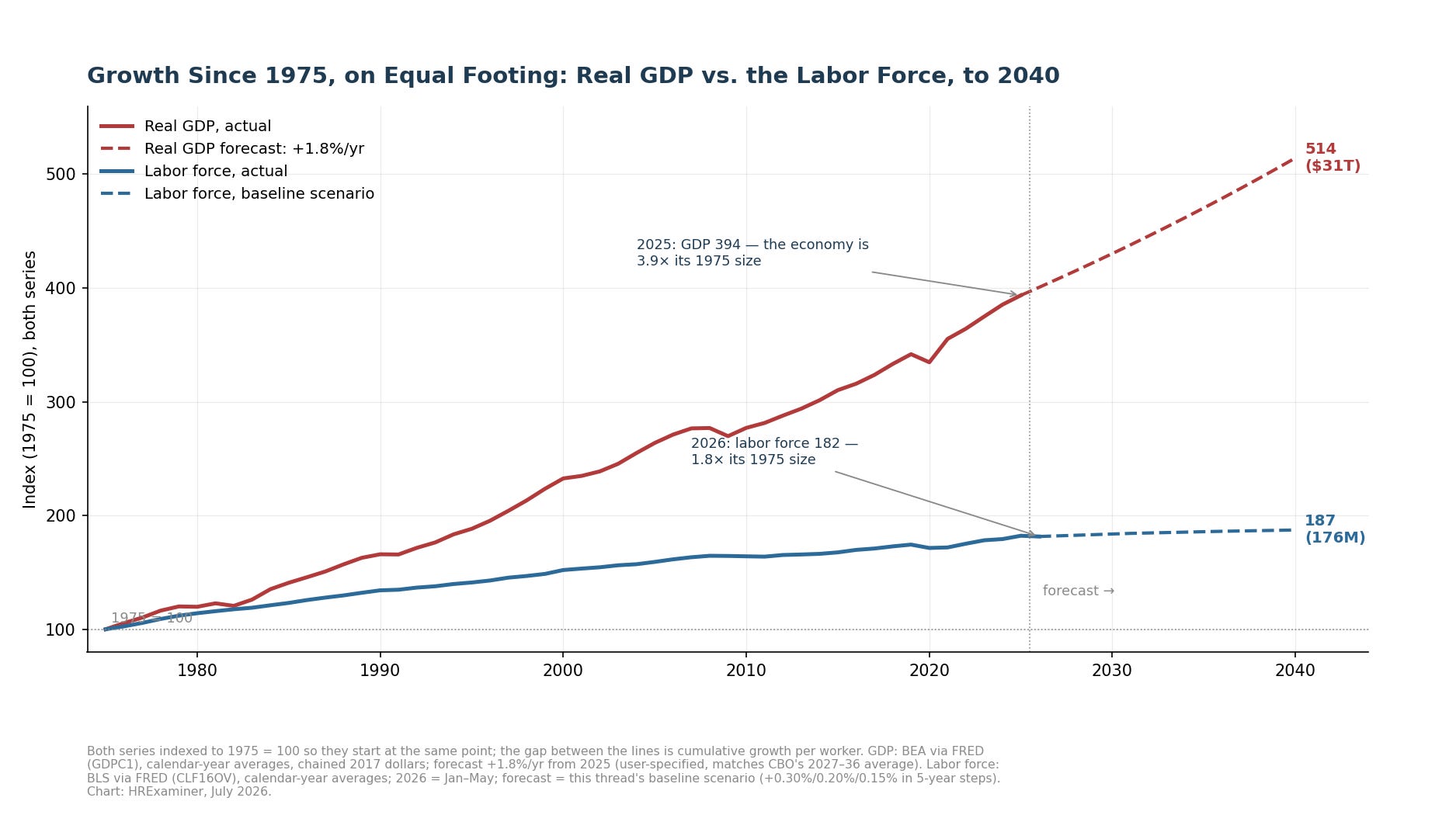
Figure 13. GDP and the labor force, both indexed to 1975 = 100. The wedge between the lines is output per worker.
The forecasters all live inside this formula, which is why they agree. CBO says 1.8 percent growth through 2036, easing to 1.6. The Fed says 2.0 for the long run, the IMF says 1.8, and private consensus sits in the same range.
Then there is the White House at 3 percent. That number requires either workers that current immigration policy forecloses or productivity America has not sustained since the dot-com years. Every administration does this, and it is a budget device, not a forecast.
Compound the difference to 2041 and the gap is an economy about 20 percent larger. Several trillion dollars are riding on which assumption you buy.
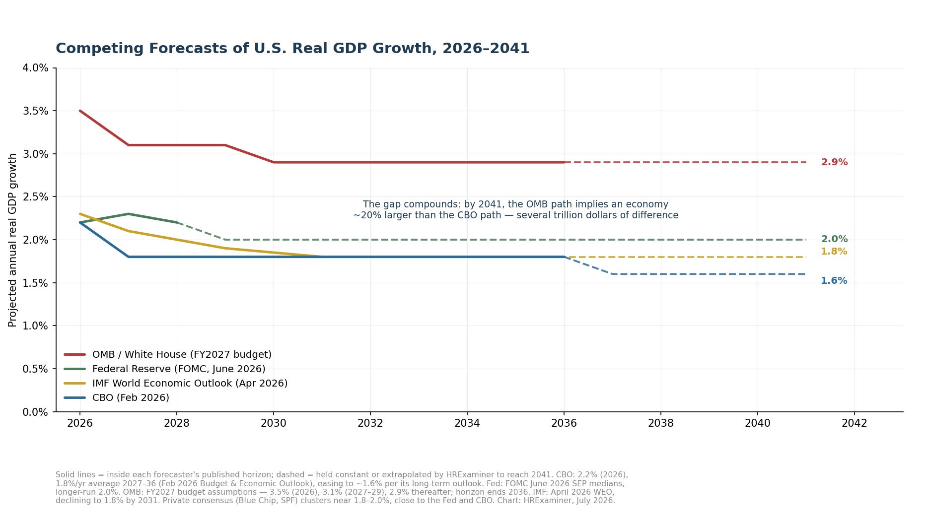
Figure 14. Competing GDP forecasts, 2026–2041. One of these lines is not like the others.
7. What a Zero-Growth Population Implies for GDP
Set population growth to zero and run the formula. Three things fall out, and none of them are optional.
First, the arithmetic. If the workforce stops growing, every point of GDP growth must come from productivity. A 1.8 percent economy needs 1.8 percent productivity growth, every single year, forever.
American productivity has averaged about 1.5 percent since 2005. So the standard forecast is possible, but it leaves zero slack. Miss on productivity, or get the shrinking-workforce scenario, and the projected economy simply does not show up.
This is not a thought experiment. Deaths pass births around 2030, and the workforce may have peaked already.
Second, the difference between total and per-person prosperity. Zero population growth does not mean your standard of living stalls. If productivity grows, income per person grows even while total GDP flattens, and Japan has been demonstrating this for thirty years.
What flattens is everything scaled to total GDP. Debt ratios get worse without any new borrowing. Social Security and Medicare run on the ratio of workers to retirees, and that ratio rots fastest exactly when population growth stops.
Look back at the pie chart in Figure 3. About 170 million people in the labor force are carrying about 172 million who are not. Every forecast in this paper says the carried half grows against the carrying half.
Third, what becomes valuable. In a labor-scarce economy, the premium moves to anything that raises output per worker. That means automation, better matching of people to jobs, and longer healthy working lives.
CBO put a machine-productivity dividend into the national forecast for the first time, worth about a tenth of a point a year. Whether that is timid or wildly generous is the biggest open question in American economics. The vendors will tell you it is timid, and the vendors are selling something.
8. What This Means for Workforce Planning
Workforce planning grew up in a world where labor supply was somebody else’s problem. You forecast demand, you posted requisitions, and the market delivered. That world ended in November 2025.
Supply is now the constraint, and the plan that ignores it is a wish.
Start with the arithmetic your own building. If the national workforce is flat, your net new hires come from someone else’s payroll. Every growth plan in your industry is a raid on a fixed pool, and the pool knows it.
That changes the economics of retention. When replacement is easy, turnover is a nuisance and retention programs are soft. When replacement means outbidding a competitor for scarce people, every point of retained turnover is headcount you did not have to buy at market price.
It changes the value of the workers you already have. The median worker is 42 and heading older. Health, ergonomics, flexible schedules, and phased retirement stop being benefits-brochure padding and become supply-chain management for labor.
It changes where skills come from. If you cannot hire the skill, you build it, and internal mobility becomes the cheapest labor market you have access to. The companies that treat their own people as the primary talent pool will out-staff the ones still waiting for applicants.
It changes the automation conversation. Automation used to be a cost play with a layoff attached. In a shrinking labor market it is a coverage play, and the honest question is which work should stop requiring a person at all.
And it changes planning horizons. Immigration policy can swing your local labor supply faster than any birth rate ever will, in either direction, on an election cycle. A workforce plan without policy scenarios is a plan for exactly one version of the future.
Plan the supply side. Demand was never the hard part.
9. A Meaner War for Talent — or Something Stranger?
Every shortage produces the same headline. The war for talent is back, and this time it is forever. Before you buy it, remember where the phrase came from.
McKinsey coined it in 1997 to sell consulting. It has been declared permanent in every tight market since, and repealed in every recession. Skepticism is the correct opening position.
The case for a hotter war is real, though. Supply is flat or falling for the first time in the modern record. The demographic engines are spent, the immigration tap is closed, and six million exits a month means your best people always have somewhere to go.
In that world, scarcity is structural, not cyclical. Wages ratchet. Poaching gets industrial. The talent war stops being a metaphor and starts being a line item.
Now the case against. A war for talent assumes demand for labor holds steady while supply shrinks. That assumption is doing a lot of unexamined work.
The same machine-productivity bet that props up the GDP forecast is a bet against labor demand. If the software does what its sellers claim, demand for whole categories of work falls faster than the workforce shrinks. You do not fight a war for people nobody is hiring.
Here is the uncomfortable middle: both cases can be true at once, just not for the same jobs.
The likelier future is not one war but violent weather. Scarcity in care work, skilled trades, and anything that requires hands and presence. Surplus in routine cognitive work that software eats. And the boundary between the two moving every year.
Volatility, not shortage, is the real forecast. Two unstable inputs drive the whole system, and both are set by people who do not answer to your workforce plan. Immigration policy swings on elections, and machine adoption swings on vendor promises meeting reality.
The old war for talent had one front and one weapon, which was money. The next one has a dozen fronts that open and close without notice. The winners will be the organizations that can redeploy, retrain, and re-plan faster than the weather changes.
Do not build a war machine. Build a fast one.
10. How to Stay on Top of These Trends
Everything in this paper came from free public sources. You can run this watch yourself with modest effort. Here is the routine.
The monthly habit is the BLS Employment Situation release. It lands at 8:30 a.m. Eastern, usually the first Friday of the month. One document carries the labor force level, the participation rate, employment, and unemployment.
The single best tool is FRED, the St. Louis Fed’s free data service. A handful of series codes are worth memorizing. CLF16OV is the labor force, CIVPART is the participation rate, CE16OV is employment, CNP16OV is the adult population, and LNS17800000 plus LNS17900000 are the gross exits.
FRED will email you when a series updates. The watch runs itself, and it costs nothing.
The annual calendar matters as much as the monthly one. Every January the survey absorbs new Census population controls, which is what caused the jumps in 2000 and 2025 and will likely cause a drop in 2027. Read January data knowing the break is coming.
Each winter, CBO publishes its Budget and Economic Outlook and its Demographic Outlook, which hold the immigration assumptions under every long-run number here. Each late summer, BLS updates the ten-year labor force projections. Each May, the foreign-born workers report updates the immigration picture, and the Fed publishes its growth outlook quarterly.
Three reading habits separate a serious watcher from a headline consumer. Watch levels and gross flows, not just rates, because a rate can fall for reasons that have nothing to do with behavior. Ask what happened to the denominator before you believe any ratio.
And learn to tell a measurement event from an economic event. A January revision, a survey change, or a shutdown data gap will masquerade as news to anyone who does not know the calendar. The October and November 2025 holes in these charts are exactly that kind of thing.
The numbers are good. They reward people who know how they are made.
Appendix A: Methods and Sources
Historical series are Bureau of Labor Statistics and Bureau of Economic Analysis data, pulled through FRED, the St. Louis Fed’s data service. All BLS series are seasonally adjusted. October and November 2025 are missing at the source for several series, and January values include annual Census population-control revisions, flagged on the affected charts.
· Civilian Labor Force Level — CLF16OV (BLS via FRED)
· Employment Level — CE16OV (BLS via FRED)
· Civilian Noninstitutional Population — CNP16OV (BLS via FRED)
· Labor Force Participation Rate — CIVPART (BLS via FRED)
· Civilian Labor Force, Women — LNS11000002 (BLS via FRED)
· Labor Force Flows, Employed to Not in Labor Force — LNS17800000 (BLS via FRED, from Feb 1990)
· Labor Force Flows, Unemployed to Not in Labor Force — LNS17900000 (BLS via FRED, from Feb 1990)
· Real Gross Domestic Product — GDPC1 (BEA via FRED, chained 2017 dollars)
Projections, official outlooks, and reference publications:
· BLS Employment Projections, median age of the labor force (2004–2034): bls.gov/emp/tables/median-age-labor-force.htm
· BLS Employment Projections program (labor force growth averaging 0.3 percent per year, 2024–34): bls.gov/emp
· BLS Monthly Labor Review, “Labor force change, 1950–2050” (historical median age): bls.gov/opub/mlr/2002/05/art2full.pdf
· BLS, Labor Force Characteristics of Foreign-Born Workers: bls.gov/news.release/forbrn.nr0.htm
· BLS, The Employment Situation (monthly release): bls.gov/news.release/empsit.nr0.htm
· CBO, The Demographic Outlook: 2026 to 2056 (immigration and population assumptions): cbo.gov/publication/61994
· CBO, The Budget and Economic Outlook: 2026 to 2036 (GDP projections): cbo.gov/publication/61882
· Federal Reserve, FOMC meeting calendar and Summary of Economic Projections: federalreserve.gov/monetarypolicy/fomccalendars.htm
· IMF, World Economic Outlook, April 2026: imf.org/en/publications/weo (April 2026)
· OMB, the President’s FY2027 budget (growth assumptions): whitehouse.gov/omb/budget
The scenario paths, the median-age extension past 2034, and the not-in-labor-force subgroup estimates are my calculations anchored to those sources, with methods stated in the figure notes. Gross flows count transitions, not people. The subgroup figures in Section 2 are good to plus-or-minus one to two million.
A closing note on hygiene. Everything here rests on a survey of sixty thousand households, under definitions last revised in 1994. The numbers are the best available, and they are good. They are not the economy itself. That distinction always matters. It matters more than usual now, when the gap between who is in the country and who is in the population estimate is the widest it has been in a generation
Absolutely fantastic insights. You put into words what I’ve been seeing. I just couldn’t connect the dots. Thank you!