



You can’t forecast the impact of AI without understanding the world it hits. It does not hit the same everywhere.
I’m trying to sort out the relationship between population, economic performance, and AI over the next fifteen years. This analysis covers the US, its states, and its top 25 metro areas. The forces involved are not American peculiarities.
Birth control, broad spectrum media, and the educational attainment of women push fertility rates down wherever they appear. The result is an aging workforce. Population growth slows, stops, then reverses.
The last piece, Peak Workforce, covered the shrinking labor force. The decline started in November 2025 and will run at least a generation. Declining immigration speeds it up.
For all of history, population growth drove economic growth. That’s over. We are entering a period where economic performance depends on productivity gains, not headcount.
Quality of life depends on how the transition goes.
AI’s impact will not be even. Some states and metros will do better than others. Understanding your local situation matters more than understanding the national one.
The two downloads at the end define the situation. One is an atlas of the states, DC, and Puerto Rico. The other covers the 25 largest metro areas.
This piece teaches you to read the charts.
The heart of both atlases is the population pyramid. A pyramid shows the distribution of each sex in the population, in five-year age bands. For most of history, young people vastly outnumbered old people everywhere, and the shape was an actual pyramid.
Here’s a pure one.
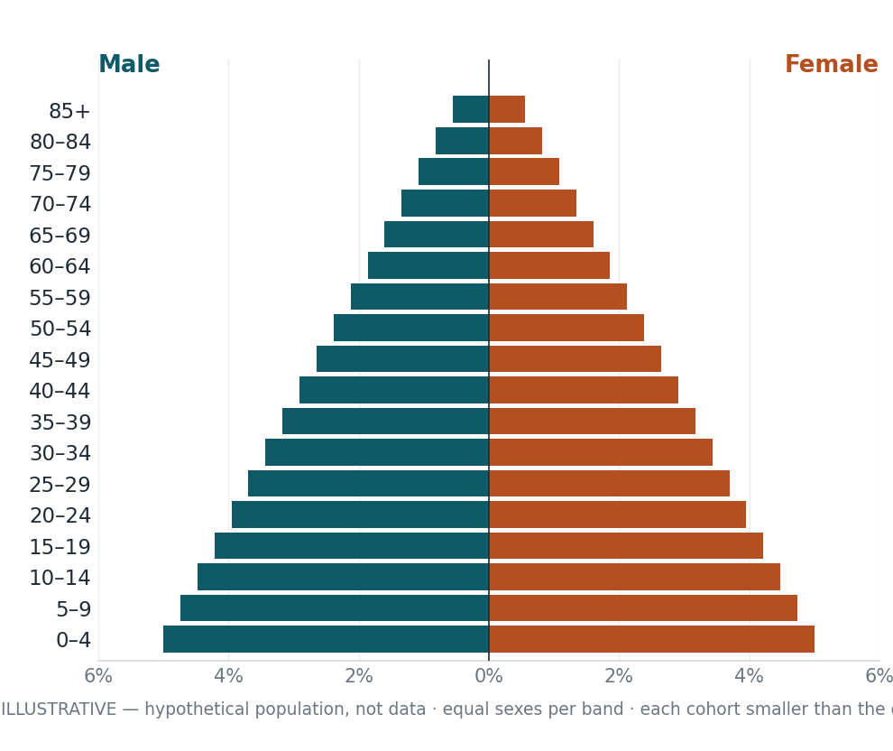
There are no pure population pyramids in the wild. The workforce in each is the group of people between 16 and 65. That’s the formal definition of the labor force. Here are the four types you are most likely to see.
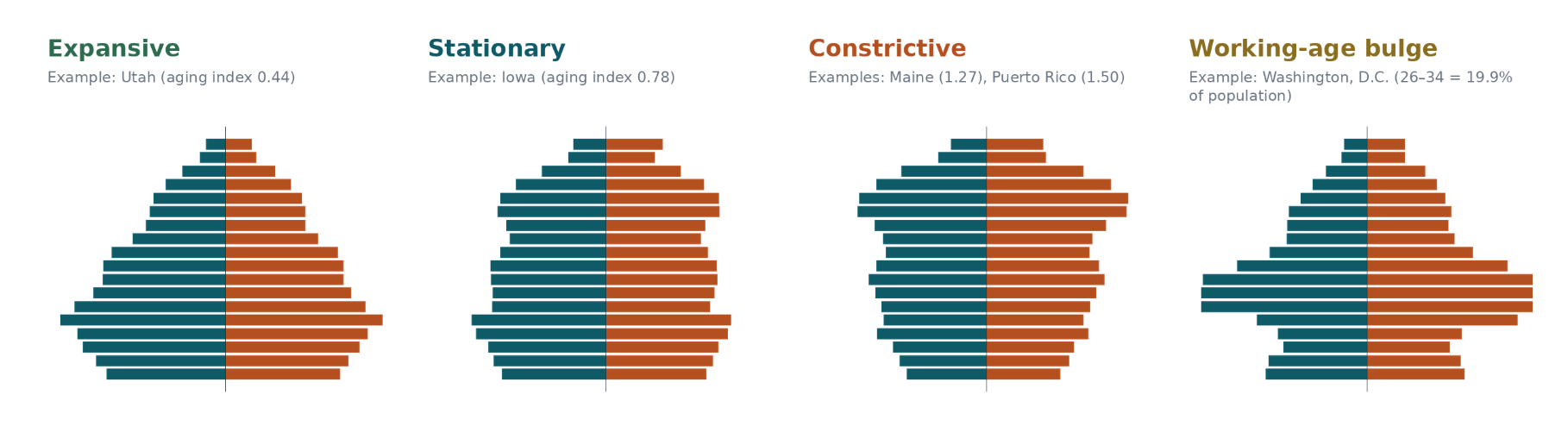
Expansive
Example: Utah (aging index 0.44)
The base is wide. Every cohort of kids outnumbers the one above it. That’s fertility doing the work, year after year. It means the workforce of 2040 is already sitting in elementary school. It also means schools, pediatricians, and starter homes eat the budget now. Exactly one American jurisdiction still looks like this. It’s Utah. Nobody else is close.
Stationary
Example: Iowa (aging index 0.78)
A column, not a pyramid. Cohorts run the same size from kindergarten to middle age. Births and deaths cancel each other out. The workforce replaces itself one for one. There’s no surplus, no deficit. This is where most American states live right now. It reads as stable. The aging index says it’s in motion.
Constrictive
Examples: Maine (1.27), Puerto Rico (1.50)
The base has inverted. There are fewer children than retirees. Read that again. The replacement workforce is smaller than the one walking out the door. This is not a forecast. It has already happened in eleven states. Census counted them. Every succession plan in these places is competing for the same shrinking pool of thirty-year-olds.
Working-age bulge
Example: Washington, D.C. (26–34 = 19.9% of population)
This is not a pyramid. It’s a bulge of twenty- and thirty-somethings stacked in the middle. Migration built it, not maternity wards. Magnet cities have this shape. Participation looks terrific. Don’t be fooled. The shape holds only as long as the next van arrives. This workforce is rented, not owned. Landlords should know the difference.
For each state and metro area, there are a bunch of bits of numeric data besides the population pyramid.
Aging index · forecast: The share of people 65 and over divided by the share 18 and under. Cross 1.0 and retirees outnumber children. This one number drives every classification in the atlas. The projections next to it run the index’s own 2022–25 drift straight out to 2030, 2035, and 2040. That’s a trend extrapolation, not a demographic model. Most of 2040’s children haven’t been born, and we decline to invent them.
Total population: Resident population, July 1, 2025. Census Bureau Vintage 2025. The one number in this atlas nobody argues with.
[Metro edition: built up from each CSA’s component metro and micro areas. The parts sum to the whole.]
Labor force: Everyone working or actively looking. States, D.C., and Puerto Rico come from BLS/LAUS, seasonally adjusted, May 2026, preliminary. The national figure comes from a different survey: the CPS household survey, same month. Two agencies’ methods, two answers. The state numbers will not add up to the national number. They aren’t supposed to. Anyone who tells you otherwise hasn’t read the footnotes.
[Metro edition: BLS metro data, May 2026, not seasonally adjusted, metro components only. The micropolitan areas are missing about 3% on average, closer to 10% around Dallas–Fort Worth. We say so because you’d find out anyway.]
Avg annual growth: Compound annual growth from the April 2020 census to July 2025. We computed it; the two endpoints are official. If you want to check the math, the math is checkable. That’s the point.
Labor force participation: The share of civilian noninstitutional adults 16 and over who are working or looking. BLS/LAUS, seasonally adjusted, May 2026. Puerto Rico runs its own household survey through its own Department of Labor; that figure is from January 2026. Different island, different survey, same definition.
[Metro edition: there is no official metro participation rate. Nobody publishes one. So this is labor force divided by resident population 16+, same geography top and bottom. It’s an approximation and it’s labeled like one.]
Average (mean) age — No agency in America publishes an average age. We built one from the 2024 cohort shares using bucket midpoints. It’s good to about a year either way, and it wears the label “(est.)” everywhere it appears. When a number is homemade, it should say homemade.
Median age — The age that splits the population in half. Census Bureau, 2024. Published, official, citable. When the argument gets heated, this is the number that survives.
National rank · U.S. share — Rank among the 52 geographies in this atlas (50 states, D.C., Puerto Rico) by July 2025 population, plus each one’s share of the 341.8 million national total. Census publishes the populations. Somebody had to do the ranking. That was us.
[Metro edition: ranked among all 181 stateside Combined Statistical Areas. Being top-25 is the price of admission.]
Top 5 Industries: For each state or metro, the Top 5 industries, their workforce size, and the percent of the labor force are presented. This is the ground where the impact of AI is most likely to be felt.
Components of Change: Population growth comes from one of three sources: Internal Growth (births minus deaths before migration and immigration
Migration (movement in or our of state)
Immigration (net growth from international sources)
Population and Labor Force Forecasts: Growth in five year increments starting now and ending in 2041.
The fine print, up front — The vintages differ on purpose. Each number is the newest official figure its series offers, and pretending they all share a date would be tidier and wrong. Below the grid on every page: the official Census components of change, April 2020 through July 2025, and the migration trend. The industry figures come from the 2024 ACS and count employed civilians. That’s a different universe than the labor force number two inches away. They won’t reconcile. Universes don’t.
The atlases each contain detailed descriptions of methodology and references used. Going forward, the discussion of AI’s likely impacts will rest on the data in these two atlases. Let me know if you’d like the powerpoint versions.
Here’s a sample:
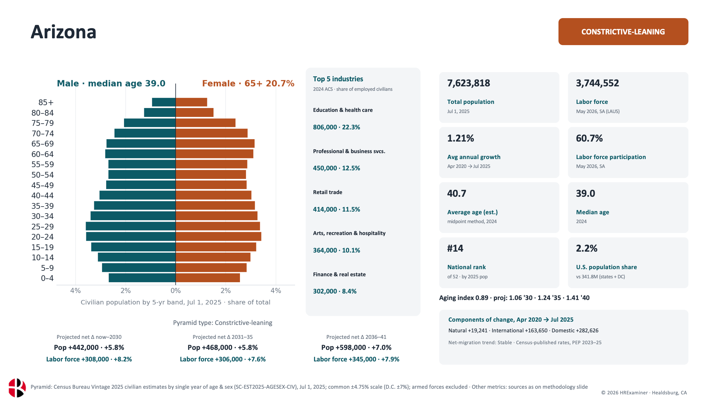

Photo by Osama Elsayed on Unsplash
John, the two books by Charles Goodhart and Manoj Pradhan are well worth reading on this topic. If you get the second get the kindle version as the hard copies are amazon on demand. The former (demographic reversal) I enjoyed more but the second - unanchored central banker - is more current.